Brenton Hall Identity and Signage
Categories: Case studies
Every design project is a collaboration. Successful projects take two to tango; the best results happen when client and designer each bring something unique and important to the table. Working with Eli Holtman of the CPM Group (Conscientious Property Management) in Narberth, Pennsylvaia is about as collaborative as it can get. Eli contacted me back in January of 2010 (after reading this very blog) to discuss creating sign lettering for one of his apartment buildings, Brenton Hall. Eli’s brief explains it better than I ever could:
Dear Mr. Korwin,
I found your blog and website while searching for ‘Architectural Lettering’. I wanted to write for a couple reasons. First to say how impressed I am with your body of work and your attention to detail. I am not a graphics professional, but I love fonts (esp. 1920s–1960s). I’m attaching a few photos that I think will resonate with you the way some of your blog shots have with me.
I’m also writing because I’ve been stymied for a year on a font selection for a project; maybe you can help. I own and operate a few small apartment houses in Narberth, PA. It’s a Mayberryesque town outside of Philadelphia. It was built out from 1880–1930. Most of the action was from 1910–1920. Then there was a burst of activity in the fifties adding some small commercial buildings to the walkable downtown. A little over a year ago I bought a 25-unit apartment building 1/2 block from the center of town on a transitional (from commercial to residential) street. My neighbors are single family homes, homes converted to apartments, homes converted to offices and small office flats. The apartment building, Brenton Hall, was built in 1926. It is a 3-story brick walkup. Sort of a ‘compressed’ arms type building. It was in bad shape and it’s been a busy year replacing piping, sanding floors, painting, patching, carpeting, etc. I am including a couple photos of the building. I want to replace the wrought iron lace work over the entrance with a sign panel including the name, “Brenton Hall”, and the street numbers (“115” on the left and “117” on the right). As I’ve thought about it over the year, my mind keeps coming back to a solid support structure bowing out toward the street. The lettering “BRENTON HALL” would be in polished stainless, with standoffs. The street numbers will be smaller and in each of the lower corners. At night, each letter will sit over it’s own pool of light. The numbers will be lit as well, LEDs preferred.
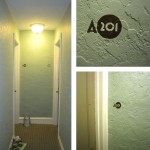
Also, in the hallways, I will have stencils cut so that I can paint the apartment numbers on the walls (in the photo you can see the temporary numbers). The apartment numbers will look hand-painted. Sagey-green, darker than the hall color but in the same hue, maybe with a black or grey shadow or outline. I will need a compatible number font for those. The apartment numbers include the letter “A” or “B” and the numbers “101, 102, 103, 104, 201, 203, 204, 301, 302, 303, 304”. Example: A-203. (Not necessary, however, I like big round zeros, I like when 3’s and 5’s drop low.)Brenton Hall color swatches. Eli gave me just about everything I would need to work on this project.
Thanks for your time and best regards,
Eli HoltmanPS: you can learn a little about the buildings and town on our website, www.narberthapartments.com; also, there is a one-minute commercial for the Brenton Hall apartments on YouTube.
Eli is a man who knows what he wants, and is also damn good at making it happen. What I brought to the table was my obsessive attention to typography. But we share a love for subtle anachronism (e.g. archaic state abbreviations, like “Penna.” and “Calif.”), and we saw very much eye to eye throughout the process of creating the design.
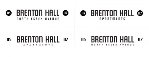
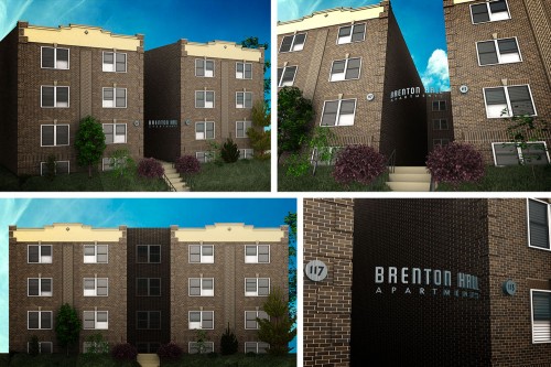
We tweaked the spacing a bit, and mixed and matched some of the elements. In order to make the decision making process easier, I decided to do an overly detailed 3D visualization of Brenton Hall. Having never been there before, and working only from photographs, I’m pretty happy with how well the visualizations turned out. The 3D renderings gave us the ability to figure out exactly how this sign would be constructed, and allowed us to preview the new look from different pedestrian perspectives.
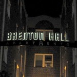
Once we finalized the look of the sign, the fabrication process began. Eli provided me with very precise specs and measurements, and I was able to create CAD-ready files so that the sign elements could be cut out of metal by waterjet. As the finished pieces arrived over the coming weeks and months, Eli sent me updates showing the sign in various states of completion. There is something extremely satisfying about seeing a finished product in metal. I love print work, but steel and aluminum beat paper. Thems the rules.
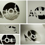
After Brenton Hall’s main sign was designed, we focused on the interior signage, which was to be painted directly on the hallway walls. After we finalized the letter-number combinations, Alyssa, the talented stencil cutter, stepped in to create a stack of carefully designed stencils that Eli could use to paint the numbers on to the rough plaster walls outside of each apartment.
I was fortunate to be able to visit Narberth in April when Brenton Hall’s sign was finally revealed to an eager audience of “Narbs,” including some Brenton Hall tenants. Ice cream novelties were served, classic cars were parked along North Essex Avenue, and a splendid time was had by all.





Looks terrific!
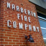
This looks awesome! What is the font called in the photo of the fire-house?
Hey Jess! I believe it was probably a sign face used by the Mittens company, but in the digital world you can find close matches with Raleigh Gothic or Alleyway JNL.