Ain’t nothing like seeing a design come to life.

Metal type
Categories: General updates

Categories: General updates
Ain’t nothing like seeing a design come to life.

Categories: Inspiration
Just had a chance to watch the beautiful 3 Union Shop, a short documentary about the Colby Poster Printing Company, written and co-directed by C. R. Stecyk III of Dogtown fame: I’ve been collecting Colby posters for a few years (they even had a role in inspiring some of my wedding collateral), and I had the […]

Categories: General updates, Inspiration
The Duro Decals brand, which still exists today, has been knocking out good, wholesome, sturdy display type and lettering (in decal, sign, and stencil form) since 1938. The Chicago-based company begat “Duro Dan,” their quirky advertising mascot, a sort of elvish, mustachioed gnome-like character that touted Duro’s wares during the middle of the 20th century. […]

Categories: Case studies
Every design project is a collaboration. Successful projects take two to tango; the best results happen when client and designer each bring something unique and important to the table. Working with Eli Holtman of the CPM Group (Conscientious Property Management) in Narberth, Pennsylvaia is about as collaborative as it can get. Eli contacted me back […]

Categories: Case studies, General updates, Inspiration
One of the ongoing projects we’ve been working on at the International Printing Museum has been The Ludlow Project, an effort to augment our collection of Ludlow matrices to be as complete as possible. Months ago, we decided to bring the campaign to Kickstarter, where there have been a significant number of successful letterpress-themed projects. […]

Categories: General updates
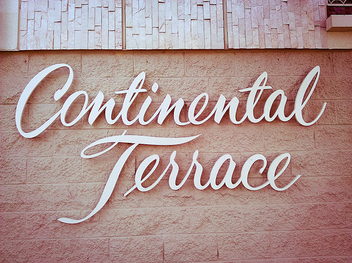
Continental Terrace, Long Beach, originally uploaded by jaykay109. Gorgeous script 3D sign lettering on an apartment building in Long Beach, California. I live for “perfume scripts” like these.
Categories: Inspiration
Some people hoard animals in need of a good home; I hoard posters. While my friends (link 1 and link 2) were in town, we headed over to Olvera Street in downtown Los Angeles, where a street fair augmented the already-festive atmosphere of the oldest part of LA. I spotted this hard-to-miss, day-glo poster and […]

Categories: Rants
After I posted my article about the Manzanar War Relocation Center’s entrance sign, I received this email: Josh: I ran across your Dec 24 entry regarding the Manzanar relocation sign. My father, who was interned there, painted the sign. He passed away four years ago but was a graphic artist who did a lot calligraphic […]

Categories: Rants
Update (January 5, 2010): After posting this article, I received an email from Mark Matsumoto, whose father, Akio Matsumoto, was a commercial artist interned at Manzanar during the War. According to Mark, Akio Matsumoto was the person who painted the sign. Needless to say, this information drastically affects my original theories about the sign’s lettering! […]

Categories: Inspiration
One of my favorite aspects of living in Southern California is the local architecture and its accompanying signage. Many of the schools in my area were built in the 1950s, 1960s, and 1970s, and lots of them utilize gorgeous, low x-height, geometric titling faces like the ones on which Neutraface is based. The Southern California […]