The Connie Dial Web Presence
Categories: Case studies, Inspiration
A few months ago I posted a teaser image from a project I was not yet ready to announce. The project has actually been complete for a little while now, so I can finally go into detail about it, as I am wont to do.
Connie Dial is author living in Los Angeles county, and spent 27 years with the LAPD. Her experience as a detective and working undercover gave her plenty of inspiration to write. With the release of her first big novel, she wanted to promote her work on the web. We built her site entirely in WordPress so that every aspect of it is easy to edit and manage.
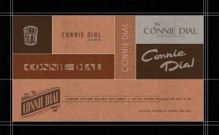
Visually, it was decided early on that we would pursue a sort of “film noir and Art Deco meets Los Angeles Police Department” look. I gathered a collection of images that were on point; these included images from Dragnet, photos of building signage (including the iconic Broadway Hollywood sign), shots of the LA courthouse, and a selection of vintage police ephemera. I liked the wispy, foggy, “diffuse glow” feel; it lends itself well to the lighting and lens choices of old Hollywood films, and also to the smoggy feeling of how Los Angeles used to be (it’s actually not as bad anymore, save for all the brush fires we have here lately). In looking for commonalities amongst the images I gathered, I found a tendency toward the architectural detail of parallel lines and three-dimensional surfaces—the “streamline” look. It occurs also on the Beretta 9mm pistol—another cop tie-in. There’s also the motif of the sunburst, prominently used on the LAPD badge. Typographically, I drew inspiration from said badge, as well as vintage signage and newspaper design.
After presenting a slew of sketches, Connie selected a sketch that was derivative of a combination of an old Brown Derby menu and the Broadway Hollywood sign. I decided it would be well-worth the effort to create the logo as a 3D model of a rooftop sign, and to use the model as an element of a virtual landscape evocative of the zeitgeist I endeavored to recreate. In the process, I may have become a bit carried away, as I created a pretty realistic neon light system connected to the extruded letterforms. I wanted it to look as convincing as possible, and so I crafted the tubes in such a way that they could actually be manufactured—at least according to my extremely naïve knowledge of neon light design. It’s hard to tell from the resolution on the website, but when rendered up close with a glass material on the tubes, it looks pretty neat. This is why I blog about our projects—some of this stuff would never see the light of day otherwise.
Interesting note: in researching The Broadway Hollywood and its signage, I found that they had recently created a pretty nice looking website, including a slightly revamped version of their building’s roof logo. Even better: further research uncovered a new, custom typeface that was developed specifically for the building’s new branding. I love when businesses appreciate what they have, rather than trying to erase their history altogether. This is a terrific example of how things should be done—drawing direct inspiration from the building’s history and iconic visual motifs. Kudos.
Visit Connie Dial’s site at www.conniedial.com, and see this entry on the three steps ahead portfolio.


No comments yet.