A reader wrote to me today to find out more about how the airbrush effects were achieved in the Gallatin “Listening to Wine” poster design. The design had been based on the feel of many wonderful posters by Adolphe Mouron Cassandre, whose dramatic shading effects defined an era of 20th century advertising posters. As a […]
Tag Archives: retro
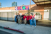
NYU Stern Orientation Program print photos
Categories: Case studies
This project has been previously detailed, but I recently photographed the actual booklets for posterity. Here’s how they came out.

Josh & Alyssa Wedding “Save the Date” Postcard
Categories: Case studies
My fiancée Alyssa and I are not typical when it comes to our wedding planning. For one thing, we’re getting married at an unconventional venue, the Los Angeles Natural History Museum. Moreover, we both work in design, and there’s no chance in heck that we’d buy any prepackaged save-the-dates or invitations. No sir. So we’ve […]

Metal architectural lettering
Categories: Inspiration
One of my favorite aspects of living in Southern California is the local architecture and its accompanying signage. Many of the schools in my area were built in the 1950s, 1960s, and 1970s, and lots of them utilize gorgeous, low x-height, geometric titling faces like the ones on which Neutraface is based. The Southern California […]
The Connie Dial Web Presence
Categories: Case studies, Inspiration
A few months ago I posted a teaser image from a project I was not yet ready to announce. The project has actually been complete for a little while now, so I can finally go into detail about it, as I am wont to do. Connie Dial is author living in Los Angeles county, and […]
NYU Stern Orientation Program — inspiration by Erik Nitsche
Categories: Case studies, Inspiration
(Update: photos of the printed booklet are now up.) New York University’s Leonard N. Stern School of Business engaged with three steps ahead this summer to create a set of program booklets to be distributed to incoming students at Summer Orientation. Our work for Stern thus far (NYU Stern CACE Poster & NYU Stern IBEX […]
Cosmographs update
Categories: Inspiration, Rants
After my recent post on harmonographs, I ponied up for a copy of the Photo-Lettering Alphabet Thesaurus, Volume 2. And now that I can read the book in “full resolution,” I learned a bit more about these mysterious space drawings. The following is transcribed directly from the book: The figures on the following pages are […]

Harmonographs: Drawings of the Future
Categories: Inspiration, Rants
My path to discovering the world of “harmonographs” is slightly convoluted. It all began when House Industries announced that it would be digitizing and selling selections from the Photo-Lettering, Inc. type collection. Now, besides the fact that this will allow digital designers such as myself to take advantage of the analog type of yesteryear, House […]

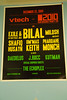
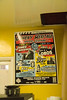
Devin’s Debut
Categories: Case studies
For a recent NYU Gallatin School of Individualized Study poster design, my brother Devin Korwin contributed his Wacom tablet skills and helped make a good poster design great. We were inspired by the gritty-yet-soft shading techniques used by advertising poster artists such as Adolphe Mouron Cassandre in the earlier half of the 20th century. After […]
Hand lettered Italian wrapping paper
Categories: Inspiration
One of my favorite things is… well… brown paper packages tied up with string. Well, perhaps not so Sound-of-Music-literally. But I love getting interestingly-packaged items in the mail, especially from foreign countries. For example I wish I had taken pictures of the post-Soviet Belarussian packaging that my first fisheye lens, the Peleng, came in. (Luckily, […]