Devin’s Debut
Categories: Case studies

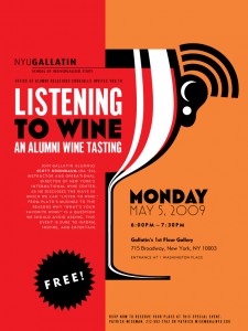
Gallatin Listening to Wine poster, first draft, straight out of Illustrator, and before Devin's Magic
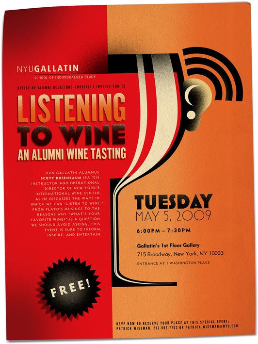
For a recent NYU Gallatin School of Individualized Study poster design, my brother Devin Korwin contributed his Wacom tablet skills and helped make a good poster design great. We were inspired by the gritty-yet-soft shading techniques used by advertising poster artists such as Adolphe Mouron Cassandre in the earlier half of the 20th century. After designing the layout, the illustration, and typesetting the copy (in Alternate Gothic and Mark Simonson’s Mostra), I handed my file over to Devin for him to add his artistic touch. The shading alone adds so much depth and interest to the design, but the aged paper texture puts the icing on the cake.
Whereas Cassandre must have got messy with stencils and airbrushes, we digital cheaters can achieve a pretty decent looking analog using Photoshop’s “dissolve” blending mode.*
I’m finding it really cool that I get to work with my brothers on occasion. My other brother, Zach, has been helping out with WordPress sites, most recently including donzukas.com (which I still have to make a portfolio entry about!)
*I can hear you all saying “so that’s what it’s for!”


Trackbacks/Pingbacks
[…] reader wrote to me today to find out more about how the airbrush effects were achieved in the Gallatin “Listening to Wine” poster design. The design had been based on the feel of many wonderful posters by Adolphe Mouron Cassandre, whose […]
[…] After the basic concept was designed and approved, my brother Devin Korwin helped out with some last-minute Cassandresque shading, just as he had for the “Listening to Wine” poster. […]