A reader wrote to me today to find out more about how the airbrush effects were achieved in the Gallatin “Listening to Wine” poster design. The design had been based on the feel of many wonderful posters by Adolphe Mouron Cassandre, whose dramatic shading effects defined an era of 20th century advertising posters. As a […]
Tag Archives: typography
Dan Reisinger Brussels Exposition Poster, 1958
Categories: Inspiration
Just scored this wonderful Dan Reisinger poster on eBay, from the 1958 Brussels World’s Fair. It even came with the original envelope in which it had been mailed to Sarkes Tarzian, Inc. / WTTV in Bloomington, Indiana, from Brussels, Belgium in 1958. According to Wikipedia, Mr. Reisinger won first prize for this poster design for […]

Star Waggons Holiday Card 2009
Categories: Case studies
We just put together this year’s Star Waggons holiday card. It’s yet to be printed1, so enjoy this 3D pre-visualization instead. We’re also dangerously short on snow here in Los Angeles, but if it were 30° colder outside, today’s rain storm would look something like the simulated North Pole shown above. Actually it’s been printed […]
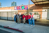
NYU Stern Orientation Program print photos
Categories: Case studies
This project has been previously detailed, but I recently photographed the actual booklets for posterity. Here’s how they came out.
Am I right, or am I right…
Categories: Rants
Just caught wind of this video posted two days ago on YouTube—a simultaneous parody of Lady Gaga and the font-of-the-decade, Neutraface. Nevermind the comedians’ unenlightened pronunciation1; it certainly proves that Neutraface has ascended to a cult status almost comparable to that of Helvetica. Thanks to Angela of Normal Modes for pointing me towards this. It […]
More vintage matchbooks
Categories: Inspiration
After the last treasure trove of matchbooks I came across, the idea of starting a collection of my own has been on my radar. I found a few on eBay that were from Torrance, California, the current location of three steps ahead and a subject of particular interest to me. The same seller had a […]

Josh & Alyssa Wedding “Save the Date” Postcard
Categories: Case studies
My fiancée Alyssa and I are not typical when it comes to our wedding planning. For one thing, we’re getting married at an unconventional venue, the Los Angeles Natural History Museum. Moreover, we both work in design, and there’s no chance in heck that we’d buy any prepackaged save-the-dates or invitations. No sir. So we’ve […]

Metal architectural lettering
Categories: Inspiration
One of my favorite aspects of living in Southern California is the local architecture and its accompanying signage. Many of the schools in my area were built in the 1950s, 1960s, and 1970s, and lots of them utilize gorgeous, low x-height, geometric titling faces like the ones on which Neutraface is based. The Southern California […]

Another day, another Ed Rondthaler quote
Categories: Inspiration, Rants
Avid readers of this blog will remember one of the first posts I made, over a year ago, about a redesign of the Star Waggons logo that I had completed at the time. There may have been some hubris, on my part, in comparing my work to that of the lettering genius Ed Benguiat, but […]

A confluence of two posts
Categories: Rants
I love when I discover that two places, people, or things that I am interested in separately have something in common. I’m currently making my way through Life With Letters …as they turned photogenic by the late, great Edward Rondthaler, co-founder of Photo-Lettering, Inc. I came across this passage today (on page 60): … Occasionally […]