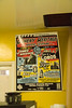
Here’s a peek at the extra special packaging we’ve put together for our brand new print series. Get ’em while they’re hot on Etsy!

All Together Now
Categories: General updates
Categories: General updates
Here’s a peek at the extra special packaging we’ve put together for our brand new print series. Get ’em while they’re hot on Etsy!

Categories: Case studies, General updates, Inspiration
Music has always been a gigantic source of inspiration for me as a graphic designer (see my wedding invitations, for example), and I’m proud to introduce the first specimens in a series of audiophile prints exclusively for the Three Steps Ahead Shop on Etsy. These examples were all inspired by music of the 1960s, specifically […]

Categories: Case studies
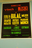
Here’s a sneak preview of the 2012 Los Angeles Printers Fair show guide cover, which will be given to all attendees of the Fair and also be available for purchase as a limited edition letterpress poster. The Fair is taking place at the International Printing Museum in Carson, California on Saturday, October 6th. Among all […]

Categories: Case studies
Our friends Jasmine & Yale are getting married soon, and Alyssa and I decided to go all-out with our letterpress habit to create their invitations. The design process started on the computer, but the goal from the start was to create something really special, where the computer would only play one part of the tune. […]

Categories: General updates
Our design for Star Waggons’ 2011 holiday card. We went with a mid-century modern look, featuring a slightly-modified Buffalo from Photo-Lettering. (more…)

Categories: General updates
I am truly undeserving of the placement I received yesterday on House Industries’ blog. Who would be so daft as to place me in the same post as Jimmy Kimmel, JJ Abrams, Deborah Sussman, Paul Frank, Coop, etc.? Not to mention the House folk themselves. In all seriousness, though, I had a great time at […]
")
Categories: Case studies
This one-off sailor jacket and canvas tote bag was emblazoned with the wordmark we assembled, inspired by one of the best boat names ever. Typefaces used are Blaktur, the over-the-top Germanic “fett” Blackletter by House Industries, and Loupot, styled after the lettering of Charles Loupot, a prominent mid-20th-century French poster artist.

Categories: General updates, Inspiration
Last night, House Industries held an evening event at the Eames Office to officially unveil their new typeface set, Eames Century Modern. This morning, I had the opportunity to spherically photograph House’s temporary exhibit, preserving it for posterity.
Categories: Rants
Just caught wind of this video posted two days ago on YouTube—a simultaneous parody of Lady Gaga and the font-of-the-decade, Neutraface. Nevermind the comedians’ unenlightened pronunciation1; it certainly proves that Neutraface has ascended to a cult status almost comparable to that of Helvetica. Thanks to Angela of Normal Modes for pointing me towards this. It […]

Categories: Inspiration
One of my favorite aspects of living in Southern California is the local architecture and its accompanying signage. Many of the schools in my area were built in the 1950s, 1960s, and 1970s, and lots of them utilize gorgeous, low x-height, geometric titling faces like the ones on which Neutraface is based. The Southern California […]
Josh Korwin has been running Three Steps Ahead, a creative design studio, since the late 1990s. He has been a typography nerd for as long as he can remember, and rabidly collects (and sometimes sells) just about everything with neat type or lettering on it. While graphic design and web design fill most of his days, he dabbles in photography and letterpress printing.