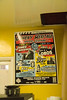
Our design for Star Waggons’ 2011 holiday card. We went with a mid-century modern look, featuring a slightly-modified Buffalo from Photo-Lettering. (more…)
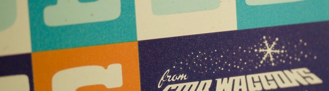
Star Waggons Happy Holidays card
Categories: General updates
Categories: General updates
Our design for Star Waggons’ 2011 holiday card. We went with a mid-century modern look, featuring a slightly-modified Buffalo from Photo-Lettering. (more…)

Categories: General updates
On Saturday, November 12, I gave a brief presentation at the International Printing Museum about a selection of typefaces that were designed by Robert Hunter Middleton for the Ludlow Typograph, a letterpress linecasting machine (for which we just so happen to be doing a Kickstarter Campaign). Focusing on the idea of “typographic influence,” I have […]

Categories: Case studies
Every design project is a collaboration. Successful projects take two to tango; the best results happen when client and designer each bring something unique and important to the table. Working with Eli Holtman of the CPM Group (Conscientious Property Management) in Narberth, Pennsylvaia is about as collaborative as it can get. Eli contacted me back […]

Categories: Case studies
Identity Design In late 2010, Three Steps Ahead was commissioned by ZYZZYVA, the premiere West Coast art and literature journal, to create an entirely new brand identity, including a redesign of their print collateral, their website, and the magazine itself. (more…)
Categories: General updates
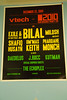
A sneak peek at a t-shirt the Night Shift created at the International Printing Museum. The silkscreen was created without the use of cameras, scanners, computers, or the like; it’s completely analog. The Vari-Typer Headliner, a photocomposition typesetting machine from the 1950s, was the descendant of a line of complex typewriters. Unlike its predecessors, the […]
Categories: General updates
I’m flattered to have been interviewed by Finch Paper about our wedding invitation design (which was printed on Finch) and about my career as a designer. Read the full interview here!

Categories: Case studies
This one-off sailor jacket and canvas tote bag was emblazoned with the wordmark we assembled, inspired by one of the best boat names ever. Typefaces used are Blaktur, the over-the-top Germanic “fett” Blackletter by House Industries, and Loupot, styled after the lettering of Charles Loupot, a prominent mid-20th-century French poster artist.
Josh Korwin has been running Three Steps Ahead, a creative design studio, since the late 1990s. He has been a typography nerd for as long as he can remember, and rabidly collects (and sometimes sells) just about everything with neat type or lettering on it. While graphic design and web design fill most of his days, he dabbles in photography and letterpress printing.