Tag Archives: 1960s

Barton Bee Line Legs Box

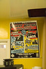
I just love packaging from the ’60s. This one may have been printed later (it says “Series ’76”), but I’m pretty sure it had to have been designed in the 1960s and used a few years beyond its intended shelf life.

The Heritage Club—gorgeous book design

I’m a sucker for well-designed books—the paper, the printing, the typography, the illustration, the binding. Yum. Unfortunately, well-designed, well-printed, well-typeset books are the exception nowadays, not the rule. I learned by watching the Antiques Roadshow that it became common practice in previous centuries for publishers of expensive books to sell them by subscription or in […]

Cosmographs update

After my recent post on harmonographs, I ponied up for a copy of the Photo-Lettering Alphabet Thesaurus, Volume 2. And now that I can read the book in “full resolution,” I learned a bit more about these mysterious space drawings. The following is transcribed directly from the book: The figures on the following pages are […]

House 3009 Catalog Cover

Harmonographs: Drawings of the Future

My path to discovering the world of “harmonographs” is slightly convoluted. It all began when House Industries announced that it would be digitizing and selling selections from the Photo-Lettering, Inc. type collection. Now, besides the fact that this will allow digital designers such as myself to take advantage of the analog type of yesteryear, House […]