Graphic Artists Guild, Michael Doret, and Letterpress
Categories: General updates
What do all of these three subjects have in common?
The answer is this past Saturday, October 23rd.
As a member of the Los Angeles Chapter of the Graphic Artists Guild, I helped to plan the Guild-sponsored “Evening with Michael Doret,” a splendid presentation by the accomplished graphic/type designer and letterer. It was a fascinating look into Michael’s history, inspiration, and the process behind such pieces as his design of the Graphic Artists Guild logo, and the Canter’s Food Truck. Here are a few photos from the event:
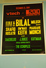
Before the evening’s event, though, I spent another day at the International Printing Museum in Carson, printing up “Hello! My Name Is:” nametags for the attendees of Mr. Doret’s talk. For the previous Graphic Artists Guild event at Dinah’s in January, I had created similar nametags, but those were inket printed and mounted on thicker card stock. This time around, I wanted to do something a bit more special. Step one was to select my type. I wanted to match the look of H&FJ’s Knockout in metal, but I also had to find a typeface and point-size that the museum had on hand. With computer design, we take for granted the ability to simply choose a font and scale it to any size; with letterpress printing, there exists no such luxury. Each font has to have been cast or carved individually in each face and size.

Video filmed by Dan Craig at the International Printing Museum, using my new T-Mobile / HTC G2 Android phone. Music is “Kelly Watch the Stars” by Air, covered by Old School Freight Train.
And here’s how they turned out:


Trackbacks/Pingbacks
[…] Out of the many machines we have at the Printing Museum, the Ludlow has a very special appeal to me, both because of its headline-oriented functionality, and because of the time in which it was most active—the 1920s through 1960s. The Ludlow had an amazing set of typefaces that were very much “of their day.” In addition to the more standard set (Bodonis, Garamonds, Caslons), Ludlow had some very cool Gothics, including R. Hunter Middleton‘s versatile Record Gothic family (completed between 1956 to 1961), and his somewhat Futura/Erbar-like Tempo family, completed between the 1930s and the early 1940s. Unfortunately, neither of them have been fully digitized, so the Ludlow is the only way to make effective use of those typefaces at the moment. I made use of the Ludlow’s Gothic offerings in creating slugs for my “Hello! My Name Is” letterpress name tags. […]