Tag Archives: Neutraface

Am I right, or am I right…

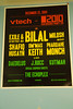
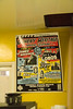
Just caught wind of this video posted two days ago on YouTube—a simultaneous parody of Lady Gaga and the font-of-the-decade, Neutraface. Nevermind the comedians’ unenlightened pronunciation1; it certainly proves that Neutraface has ascended to a cult status almost comparable to that of Helvetica. Thanks to Angela of Normal Modes for pointing me towards this. It […]

The SCROC Industrial Technology building

Metal architectural lettering

One of my favorite aspects of living in Southern California is the local architecture and its accompanying signage. Many of the schools in my area were built in the 1950s, 1960s, and 1970s, and lots of them utilize gorgeous, low x-height, geometric titling faces like the ones on which Neutraface is based. The Southern California […]

Neutraface is the new Helvetica

Anybody who knows me well will know that I have a major soft spot for House Industries, designers and purveyors of some of the finest typefaces and associated graphic-designery merchandise out there. Back in 2002, House released Christian Schwartz’s Neutraface, a family of fonts based on the architectural lettering specified by Richard Neutra in his […]