What’s in a Font—The Manzanar War Relocation Center Sign
Categories: Rants
Update (January 5, 2010): After posting this article, I received an email from Mark Matsumoto, whose father, Akio Matsumoto, was a commercial artist interned at Manzanar during the War. According to Mark, Akio Matsumoto was the person who painted the sign. Needless to say, this information drastically affects my original theories about the sign’s lettering! I’ve posted a follow-up with more information.
I just returned from a brief vacation to Mammoth Mountain, and on the way back down to Los Angeles we stopped at the Manzanar National Historic Site, former home to the Manzanar “War Relocation Center,” an American concentration camp for thousands of Japanese-Americans during World War II. Despite Manzanar’s picturesque location, the site is a haunting reminder of just how bad things can become when the U.S. ignores its constitution.
Many comparisons have been made between the Americans’ use of concentration camps and those used by the Nazis. With this in mind, I was struck by the lettering used on the Manzanar entrance sign, which bears resemblance to the blackletter styles appropriated by the Nazis during the first years of the second World War. The Nazi party’s use of these blackletter forms was very much a purposeful message (for more information on the topic I would recommend reading Iron Fists: Branding the 20th-Century Totalitarian State by Steven Heller). It seems odd that, at the same time as the United States was at war with Germany, and even detaining German-Americans at camps like Manzanar, the US government would use lettering evocative of the Third Reich. I decided to do some surface-level research to find out more about this lettering decision.
First, I wanted to determine the origin of the lettering style. It appears to be a simplified blackletter, more contemporary than traditional, a modernist version of a Rotunda. After searching through many, many fonts online, I could not find an exact match in digitized form. But perhaps I was using the wrong sign.
Apparently, the sign that stands at Manzanar today is a fairly faithful replica of the original, which was photographed by Ansel Adams in 1943:
However, upon closer comparison between the replica and the original, I’ve noticed a few subtle differences:
- The “M” has a bit of a downward slope in the replica which is not present in the original.
- The letter spacing was somewhat tighter on the original, with the exception of “CENTER,” which is more generously spaced in the original than in the replica.
- The shape of the “R” is wider in the original, and appears condensed in the replica.
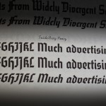
I then checked my Photo-Lettering Alphabet Thesaurus, Vol. 2, and found a very close match to the original sign’s lettering in “Seidelburg Heavy” (at right). In Life with Letters, Ed Rondthaler of Photo-Lettering, Inc. provides evidence that his company’s letterforms were used extensively by the U.S. government and military during World War II. In fact, their flagship typeface, Murray Hill Gothic, was used in countless propaganda posters and solicitations for war bonds. It wouldn’t be a stretch, then, to think that perhaps the lettering for the Manzanar sign was chosen out of Photo-Lettering’s offerings and subsequently hand carved in wood. Any irregularities, therefore, could have been artistic choices on the part of the signmaker.
So that is my hypothesis. But then why choose a typeface loaded with Germanic connotations at the same time as America was at war with the Germans? And if the U.S. government was trying to lighten the public perception of what Manzanar was, by using euphemisms like “resettlement” and “relocation” rather than “concentration” or “internment,” it would be counterproductive for them to use signage that resembled that of the enemy.
It’s possible, though, that they just didn’t get it. After all, the U.S. didn’t enter German territory until after D-Day, and so perhaps the connection was not yet made when Manzanar was constructed. It’s also strange that they used a blackletter face in all caps; it’s still legible, but it’s not really in line with how the Nazis usually typeset their blackletter headlines (with the exception of acronyms, e.g. “NSDAP”). But there’s also the possibility that the government wanted to draw a non-political connection between Manzanar’s Alpinesque landscape and that of Northern Europe. Perhaps, in a more sinister way, they wanted to dress up Manzanar as a resort destination, rather than a detainment camp. Playful Gothic lettering is frequently found in period restaurant signage, hotels, ski resorts, and pretty much anywhere that an “Old World” feel is sought. So with that in mind, the Manzanar sign could have been subtle propaganda.
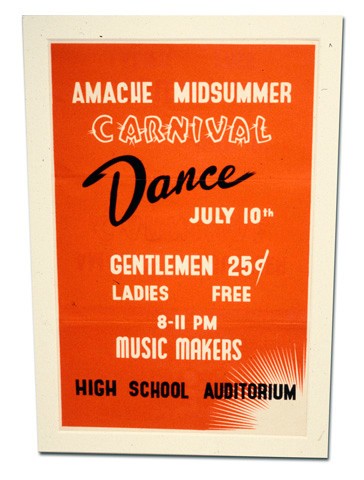
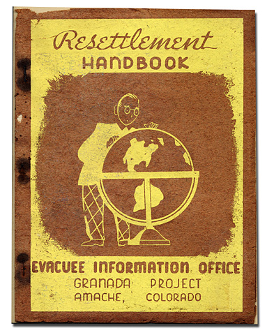
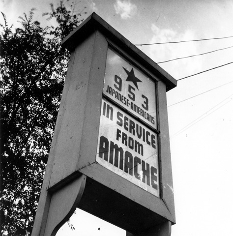
The lettering might have also felt en vogue. The lettering face used also shares a lot in common, geometrically, with some of the faces popular during the 1940s. Here are some images from the Smithsonian’s A More Perfect Union online exhibit, from Camp Amache (another detainment camp like Manzanar):
While the sans-serif lettering styles used in these examples are distinctly 1940s in their appearance, their forms and all-caps presentation share similarities with the simplified blackletter of Seidelburg Heavy. Note the unicase “M”s and “N”s, as well as the parallel legs of the “A”s. Maybe the modernized blackletter simply appeared to be of the times.
Lettering carries meaning. It’s not simply a transparent way of communicating words. I think it’s important that we as designers carefully consider the lettering and type styles that we use, especially in historical context, as their educated use can be far more meaningful than their haphazard and casual application.
As always, I’d be happy to hear from anybody who has more insight into this than my hasty research has unearthed. I’ll gladly update this article with corrections or as I learn more12.
- I’ve added a post on the PictureBubbles° Blog with a spherical panorama of Manzanar Cemetery. [↩]
- As mentioned above, a reader has updated me with further information; please see the follow-up post here. [↩]


Any suggestions for a substitute font for the sign? We are recreating it for a historical reconstruction.