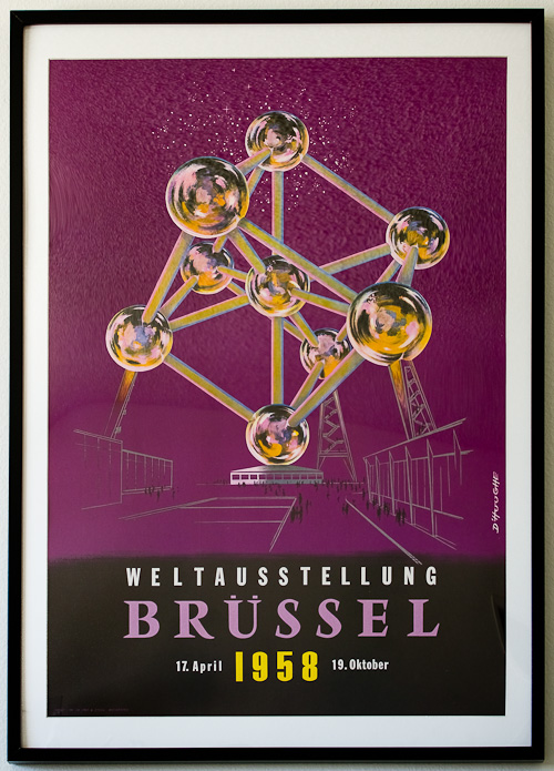
Second 1958 World’s Fair Poster Restored
Categories: Inspiration
After restoring my 1958 Dan Reisinger poster from the Brussels World’s Fair, I immediately sent off this poster for similar treatment. Depicting the Atomium, the still-standing symbol of the 1958 Expo, this poster seems to have been issued in a number of different languages (as was the Reisinger poster). I have the German edition—Weltausstellung Brüssel. The poster is signed “D’Hooghe,” but I have not found any further information about the designer/artist.
The typeface used for “BRÜSSEL” is a very close match to Vendôme, designed by François Ganeau. Vendôme is one of my favorite serif typefaces, and has been ever since I first encountered it in The Elements of Typographic Style by Robert Bringhurst. The type predates the poster by only a few years, according to An A-Z of Type Designers by Neil Macmillan:
François Ganeau was born in Paris and was principally a sculptor and theatre decorator with numerous public commissions to his credit. He was a friend of Maurice Olive, the proprietor of the Fonderie Olive in Marseilles, where Roger Excoffon was the chief designer. François Ganeau’s typeface Vendôme was cut at the Fonderie Olive in 1951-4. It is believed that Roger Excoffon assisted in the design of this face.
And according to U&lc:
Excoffon played a dual role in supervising the production and marketing of a new type named Vendome which had been designed for the Fonderie Olive by a stage designer named Francois Ganeau. With no previous experience of type design, Ganeau had managed to create a fine design which was refined and improved by Excoffon. To publicise it, Excoffon designed one of the most beautiful and elaborate type specimen books produced by any French typefoundry in the 1950s. It was produced by La Ruche, his favourite printing house in Paris where the craftsmen took exceptional care with their presswork and did complete justice to his unusual range of coloured inks.
Boy, I’d love to get my hands on that specimen.
The secondary type used on the poster is the much older, much more ubiquitous Franklin Gothic, and although I have not yet found an exact match for the “1958” numerals, they belong to a family of type styles called “Swiss Gothics” according to the Photo-Lettering Alphabet Thesaurus.


I was at this world’s fair, as a two year old in a baby carriage. My dad was stationed in Germany then, but I was born in Denver {then we went overseas until I was four}. Is there any way to get a copy of this poster?
Wow, do you have any memories of the fair? These come up sometimes on eBay but not too frequently; they were printed in a variety of languages and styles. One rare variant was recently listed: https://www.ebay.com/itm/114525381694
Hi, I bought a copy of this poster in Bozar (Brussels). They have a lot of copies in French/Dutch. If you got anyone coming to Brussels, and got some luggage space, be sure you ask for one 🙂