A Link to the Past
Categories: Case studies, Inspiration


I’ve been on a bit of a “ribbon lettering” kick lately. For this brochure/identity design, I was heavily inspired by a number of different sources, both old and new.
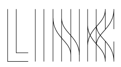
I wanted to conjure the notion of “link,” without using a cliché chain illustration in the process. The idea of roads and paths intersecting felt apropos to the concept of mentorship, and after doing some Wikimedia Commons research on such structures, I came up with a lettering style based on the look and feel of junctions or interchanges.

"Link" lettering, process
I wanted the composition of the piece to be simple and adaptable. For inspiration, I perused my copy of Meggs’ A History of Graphic Design (best textbook ever), and came across a simple-yet-gorgeous modernist poster by Lester Beall designed in 1937 for the Rural Electrification Administration. According to Philip Meggs, the poster was intended to be “understandable by illiterate and semi literate audiences,” and although my derivation was a bit more complex, I figured it would probably get the point across fairly easily to very literate university students.
After the basic concept was designed and approved, my brother Devin Korwin helped out with some last-minute Cassandresque shading, just as he had for the “Listening to Wine” poster.


No comments yet.