The Ludlow: Typographic Influence, 1931–1962
Categories: General updates
On Saturday, November 12, I gave a brief presentation at the International Printing Museum about a selection of typefaces that were designed by Robert Hunter Middleton for the Ludlow Typograph, a letterpress linecasting machine (for which we just so happen to be doing a Kickstarter Campaign). Focusing on the idea of “typographic influence,” I have attempted to trace some examples of what inspired Middleton’s designs while he worked for Ludlow from 1933–1971, and also what his designs later influenced during the first decade of the 21st century.

What I find most interesting about type design and typography is how each era in time has its own look and feel—its own zeitgeist, if you will. It gets tricky to pinpoint, though, as typographic trends tend to cycle and repeat over time. Type design and typographic style, like language itself, can last for generations, waxing and waning in popularity. Typefaces like Ludlow’s Radiant (a Modern thick-and-thin sans, like a Didot or Bodoni without serifs) were influenced by trends of the 19th century, but almost certainly became the inspiration for later designs, like Susan Kare’s Chicago font for the first Apple Macintosh. (In the New York World’s Fair example at right; “The World of Tomorrow” text almost looks like it could have been typeset on the original Mac.) In many contexts, faces like Radiant feel very 1930s/1940s. But Art Deco geometry and style regained popularity in the 1980s, in large part due to the postmodern influence of The Memphis Group, and thus we associate certain ’30s and ’40s design motifs with the ’80s.
")
Novelty plays a big role in typographic evolution—people buy what feels new (even if it’s just new to them). That was the basis behind the surge in popularity of Art Deco / Moderne consumer products in the early half of the 20th century. But technology often plays just as much of a role in type design. Technological innovations create new possibilities for type designer, but in turn, they also may impose limitations. With research and awareness of historical context, it’s often possible to see the fingerprint of specific technologies on a typeface.
")
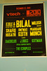
Take, for example, Coronet. Influenced in part by Trafton Script, a Bauer typeface designed by Howard Allen Trafton in 1933, Coronet was designed by Middleton to take advantage of the 17° Italic matrices offered by Ludlow. Like many other foundry type scripts, Trafton Script was limited in its design by having to sit on a rectangular block. With slanted (parallelogram) matrices, Coronet’s letterforms could slope atop one another, creating a more handwritten feel.
")
Another face designed to fit the Ludlow’s matrix technology is Middleton’s Tempo Italic. The very versatile Tempo family was conceived over the period from 1937–1942, influenced by earlier geometric sans serif designs by Jakob Erbar (Erbar Grotesk, 1922), Rudolf Koch (Kabel, 1927) and Paul Renner (Futura, 1927). Unlike these other faces, Tempo was paired with a set of true italics (not obliques or sloped-romans), featuring calligraphic, semi-script forms and alternate swash capitals. Only a select few Tempo faces are currently available in digital form, and these do not include the gorgeous italics.
")
Responding to the need for a versatile geometric sans serif family with a true italic, House Industries published Christian Schwartz’s Neutraface in 2002. Neutraface’s italic, while unique, was influenced in large part by Tempo’s italic. Hoefler & Frere-Jones’ Verlag, published in 2006, seems to have been created in part due to the incredible commercial success of Neutraface (which I’ve commented on earlier).
")
The “Heavy” weight of Tempo Condensed is unfortunately the only member of the family to officially reach the digital era.
")
But similar typographic effects can be created using condensed weights of Erbar Grotesk or Futura.
")
")
Tempo Heavy Inline is a face that looks absolutely gorgeous in print. It is similar to Jakob Erbar’s Phosphor, which was revived as Zamenhof by CastleType in 2011.
")
Tempo Bold Extended brings an entirely different flavor to the Tempo family.
")
One of its closest digital kins, Turnpike, was released by Stuart Sandler of Font Diner in 2009, although it lacks the lowercase that was present in faces like Tempo Bold Extended.
")
A fun fact about the 1932 all-caps typeface Umbra: it’s actually based on Tempo, with a shadow added (hence “Umbra”). Umbra’s Bauhaus influence brought it to new popularity during the latter half of the 20th century. Even recently, I’ve seen this face all over hipsterdom; Urban Outfitters has previously used Umbra in its constantly-changing branding.
")
Karnak, Ludlow’s geometric slab serif (or square serif, if you like), was Ludlow’s answer to foundry Memphis (1929 or 1930), a typeface designed in Germany by Rudolf Wolf1 for Stempel.
")
Dormant for many years, Karnak was digitally revived by Red Rooster in 2009.
")
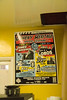
One of the major advantages of typesetting with the Ludlow system is the ability to mix different sizes easily. In these examples, gigantic (144 point) Tempo and Karnak are mixed with 72 point fonts.
")
By the 1960s, photocomposition systems (and services like Photo-Lettering) were on the rise, and Ludlow was losing a bit of its edge. Wave, with its brushy, not-quite-connecting script feel, feels distinctly like the work of Middleton. But I have a sense that Wave was never quite right for its era; it may have felt somewhat stiff and dated compared with some of the more dynamic possibilities offered by photocomposition. Nevertheless, it certainly has its charm, and was recently revived by Canada Type as Middleton Brush (2010).
Because so many Ludlow faces, with their subtle nuances, are still unavailable in the digital world, it’s incredibly important to keep the machines and matrices around. The International Printing Museum’s Ludlow Project will make it possible for designers to work with these faces in letterpress, and to translate those works into the contemporary world. Who knows, maybe we’ll get the opportunity to fully digitize some of them, too.
- Mac McGrew attributes Memphis to a Rudolf Weiss circa 1929, but several online sources state that it was designed by Rudolf Wolf in 1930. [↩]


I love the Ludlow and the quality of the freshly casted face. This was an excellent article, thanks so much for publishing it!
U and J bottom right on caps that side
What an excellent round up! There is a new digital version of Tempo available from Ludlow. The foundry, part of the Red Rooster collection of foundries, is now owned by The Type Founders and they have taken great pains to release a version of Tempo that maintains the spirit and expands upon the original in meaningful ways. https://roosterfonts.com/fonts/tempo/
Full transparency, I work with The Type Founders. But my love of type and typography predates this work by over 30 years.
Thank you so much, Tiffany! I’m thrilled to hear there’s a contemporary Tempo revival that’s been approached with care and respect for the original. I appreciate you posting about it here, and I’m looking forward to taking a closer look.