Poster draft inspired by mid-century New York
Categories: Case studies, Rants
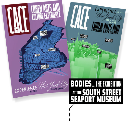
NYU Stern: CACE poster concept preview
By now you’ve probably come to understand that I have more than a small obsession with mid-20th-century graphic design. Pictured above are a set of first-drafts of a poster design we’re creating for New York University’s Stern School of Business, promoting their Cohen Arts and Culture Experience program. The program allows current Stern students to participate in very New York City-centric cultural events—such as walking tours, Broadway theater performances, and museum tours—at extremely low prices.
The concepts I’m working with blend the feeling of Life magazine, MTA graphics, and perhaps just a bit of the travel poster aesthetic that I love. More than anything, though, I’ve been inspired by an incredibly detailed article I read recently about the history of the New York City subway system’s signage (on AIGA.org, via Doug Wilson’s awesome design-related blog). I’ve focused almost entirely on the use of the typeface Tasse, a revival of Paul Renner’s Steile Futura, a.k.a. Topic., a.k.a. Renner-Grotesk. According to Mark Simonson’s post on Typophile, Renner, the designer behind the ubiquitous Futura, worked on Steile Futura from the 1930s until the 1950s. So as I work to evoke a relationship between the CACE program, experiencing New York City, and the MTA transportation system, Tasse feels like an incredibly helpful vehicle. Contrasting weights and sizes allude to the beautiful mess that the MTA signage has evolved from over the decades.
Definitely read the aforementioned article, and if you don’t have the time or energy to pay attention to every nitpicky detail, it’s still worth flipping through the incredible historical photos.
(UPDATE: To see the finished, printed design, read the follow up post.)


Trackbacks/Pingbacks
[…] in December of last year, I posted some initial drafts of the Cohen Arts and Culture Experience poster design I was working on for NYU’s Stern School of Business. Through the inevitable revision process, […]