PIASC Graphics Night Letterpress Invitations
Categories: Case studies
The Printing Industries Association of Southern California (PIASC) is the parent organization that sponsors much of the International Printing Museum‘s activities. Each year, PIASC hosts Graphics Night, a gala event at which Southern California printers congregate and schmooze, among other more important things. Graphics Night also features an awards ceremony, where best-of-industry printing and print design is recognized.
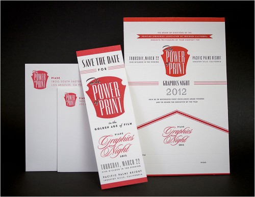
For this year’s Graphics Night event, PIASC asked the Museum and Three Steps Ahead to print and design (respectively) the invitation and surrounding identity pieces, themed around the concept of “The Power of Print in the Golden Age of Film.”1
The design of the invitations was intended to evoke the classiness of letterpress invitation and menu design from the early half of the 20th century, perhaps centered around the late 1930s through 1940s. The type is a combination of Mark Simonson’s Art Deco classic Mostra Nuova, Hoefler & Frere-Jones’ Verlag, and lookalikes for Ludlow’s thick-and-thin sans-serif typeface, Radiant: ShinnType’s Eunoia and Lanston Type Company’s Obelysk Grotesk.
The design and printing process were tied very closely together for this project. The first piece we created was the Save-the-Date bookmark, which was mailed out as a reminder along with some other PIASC promotional material towards the end of 2011. Prior to designing the piece, we worked with Neenah Paper to secure a donation of their surprisingly-great-for-letterpress Classic Crest paper in the new Eggshell finish, in Solar White and Red Pepper colorways. We had the already thick paper custom triplexed (duplex + duplex), so that the red was sandwiched in between two white sheets. In addition to making the flagship pieces obnoxiously thick, it allowed us to create a thin red stripe down the edge of the cards, mirroring the thin red rules used throughout the designs.
While the Save-the-Date bookmark looks like a two-color over one color (2/1) piece, it took many more trips through the Heidelberg Windmill 10 × 15 platen press than one would expect. We broke down the design into several plates, so that the solids and the thinner elements were printed in separate passes. This allowed us to achieve proper solid coverage without blowing out the type. Solids were printed in multiple passes as well, so the bookmark, which was the simpler of the two pieces, ended up going through the press five times, before trim out.
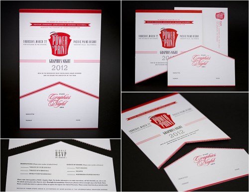
The main piece, the invitation, was designed to be mailed out as a single 6″ × 9″ card, but the piece was die cut and perforated with a chevron shape where the almost 4″ × 6″ RSVP card detaches from the invitation. The reply card then fits into the enclosed reply envelope for return. This unique design allowed us to print both the invitation and the reply card as one piece, with all of the aesthetic elegance and functionality of having two separate pieces.
The invitation was printed with a similar process to the bookmark, where solids and thin bits were segregated on separate plates. But we also added a blind pass on the front, a clear foil pass on the back, and the “extra” step of die-cutting the whole piece (which incidentally saved a lot of time that would have been spent trimming out each edge on the paper cutter).
At Graphics Night last month, both the Museum2 and Three Steps Ahead were recognized for the printing and design of the Graphics Night invitations. We were honored that Three Steps Ahead was given the Award of Excellence for design.


No comments yet.