Drayton Hall newsletter, best feedback ever
Categories: Case studies
I’ve been working with Drayton Hall, a historic landmark in South Carolina, to help redesign their print identity, including their on-site interpretive signage, their advertising, and their newsletter, among other things. The newsletter has been our most recent endeavor. They’ve had the same design for years now (worth checking out to see the “before” to my “after”), and it was definitely time for a refresh. However, they were reluctant at first to move too far from the original newsletter design, lest its “nonprofit charm” be destroyed by a flashy, gaudy redesign. Having wrestled with it somewhat, I decided to go bold; I knew we could always tone it down a bit anyway. Here’s how I presented the drafts:
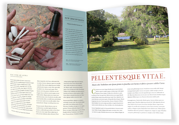
I’ve included two versions of the front cover (to show the design’s versatility) and a faux interior spread. None of this is based on existing content; it’s more of an “ideal” re-imagining of the Interiors newsletter.
The colors are consistent with the rest of our work, but I’ve tried as much as possible to keep the design feeling airy, fresh, and contemporary. I’ve set the type with generous margins and leading, which is in stark contrast with the crowded feel of the original newsletter design. I’ve included both two-column and three-column masters; I envision the two-column masters used for “feature” pages, and three-column masters used for mixed content).
The type design is again consistent with the rest of the identity we’ve been developing, but I’ve kept it more magazine-like. The new Interiors logo shares a very similar proportion to the original, but with a lighter, modern feel, and the additional flourish of the Drayton Hall illustration inside the counter of the “O.” I had originally tried serif typefaces, but I felt that the lightness of this sans-serif typeface (Aaux) helped to better communicate the concept of the interior. It feels spacious rather than solid (a bolder, more structural typeface would communicate “Exteriors” better, perhaps). Secondarily, Aaux is something of a 21st-century homage to Akzidenz-Grotesk, one of the older sans-serif typefaces (originally released in 1896). I felt that this can still bring a sense of history to the newsletter design while effectively communicating that this newsletter is about what’s happening now with Drayton Hall.
The best part is how the drafts were received:
And oh, my gosh, we LOVE where you’re going with the redesign of the newsletter; there’s dancing in the streets here at Drayton Hall. I’ve already shared it with Vera and Natalie, and they had the exact same reaction. Perfect. Love it. You, sir, are brilliant.
Thank you a hundred, million, zillion times over—I didn’t think it was possible, but you have actually exceeded our expectations. Because you hit it so perfectly, I won’t for a minute miss our old newsletter—the simple, low-tech charm that I thought was so appealing in its own way, just feels tired and amateurish to me now.
Well, I have to go and stare at your design for a little longer. Talk to you soon.
—Kristine
Best feedback ever.


Trackbacks/Pingbacks
[…] (which was actually published in 2012). Over the past few years, we reworked their wordmark, redesigned their Interiors newsletter, and created a whole bunch of environmental site signage to guide visitors through their experience […]