Creative campaigning
Categories: Case studies, Rants
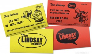
While digging through my “archives” the other day, I came across a “business card” design draft I had created for a gentleman running for sheriff’s office. The project was an offshoot of a collaboration with my friend Scott Kidder—either he or the client had originally come up with the concept of using modified versions of Monopoly‘s “Get Out of Jail Free” cards as a provocative souvenir for his campaign. Before the designs could be sent to press, though, the client dropped out of the race, and so these designs may have never seen the light of day. And to some extent I was a bit nervous about posting them, given the blatant rip-off of Parker Brothers’ intellectual property. But I’ve convinced myself at least that writing about them qualifies as editorial/academic/journalistic “fair use,” and that the cards were a parody to begin with, which also falls under fair use. But, just in case, ahem: I formally thank Parker Brothers in advance for its cooperation, and congratulate them on the excellent use of Avant Garde in their wordmark. [Grin.]
I thought at the time—and still think—that the design concept was a good one, since the goal in creating any sort of advertising campaign is to spark interest in those who see it. Regardless of how original it is to parody “Chance” and “Community Chest” cards, the idea is still a conversation starter. Isn’t that the point of graphic design altogether? To disseminate ideas in an effective and attractive way? I admit it was also a blast to try to replicate the rather utilitarian, 1930s metal typography used on the original Monopoly cards. It appeals to my eternal quest to capture the authentic, typographic zeitgeist of any chronological period that my design work references, but that’s a topic for another post. I’m also happy with the “Tom Lindsay for Sheriff” logotype, even when taken completely out of the Monopoly context. It feels iconic, I think, and certainly would have beaten the pants off of any other would-be-Sheriff’s campaign design. And this was back in the Dark Ages of 2006—eons before it was socially acceptable for American political campaigns to dabble with good design.
Parody, derivative work, and tooting-my-own-horn aside, I find that the most effective designs are the ones that feel inspired and thought-about. It’s easy to tell when a graphic design has some intellectual thought in it… when a designer is not thinking solely about aesthetics, but is using those tools at our disposal as a vehicle for driving a message. For that reason, it pays to plan—it pays to leave enough time in the creation of a design to think about what should be said. When the message itself is strong enough, good design follows.


Trackbacks/Pingbacks
[…] instance, as soon as I read the brief, I had a clear visual concept in my head. And I’d just posted earlier today about another political campaign design. Politics aside, I wanted to make this thing, whether or […]